Only 2 more days until we get the keys to our new home!!!
One of our favourite home improvement projects is painting. It’s such an easy way to transform a space and best of all it’s quick, too!
When planning the colour scheme for our Edwardian house we played it safe. Most colours were subtle and neutral tones but we did get more daring over time and turned our boring light grey dining room into a cosy blue-black space.
We learned which colours worked well together. We also learned a lot about ourselves and about our preferences and while the colour choices in our last home were very safe (and possibly a bit boring) we’ve learned that taking risks can pay off, too.
We always knew we wouldn’t be staying in our house forever and keeping things neutral seemed like the right thing to do for resale purposes but in our new apartment, we’ll be choosing a colour scheme that we want without feeling like we have to please anyone but ourselves.
Our biggest colour tip is to figure out the mood or atmosphere you want to create in a room and then choose a colour palette to suit it. And that’s exactly what we’re doing.
These are the colours we’re currently loving
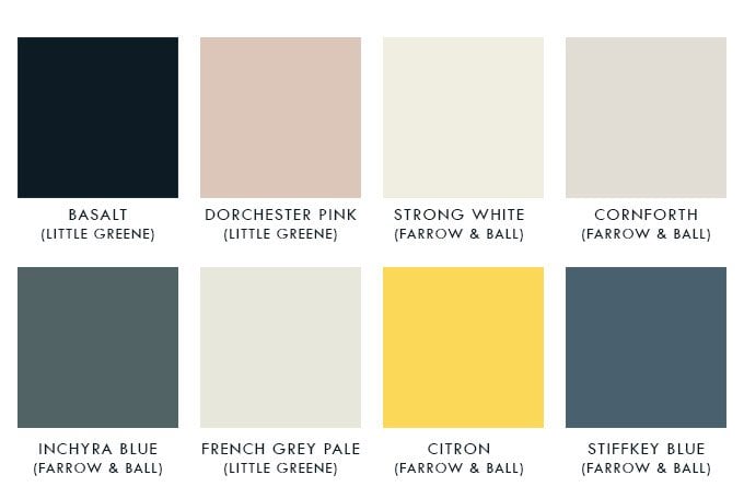
As you can see we’re leaning towards a scheme with lots of grey and blue tones but I have snuck in a bright yellow (possibly for the inside of the front door) and a dusky pink for the long bedroom which we’ll probably be turning into a walk-in wardrobe. It’s not a huge departure from the colours we used in our Edwardian house but this time we’ll be using a lot more dark and moody colours.
Usually, we keep our ceilings, doors and skirtings white because we like the way they contrast with the colour of the walls. In this apartment, we’d like to do things differently and are planning on painting everything the same hue (in some of the rooms at least).

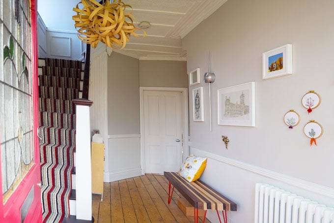
The one thing we did in our house in Manchester that we’ll definitely be doing in our new apartment is keeping the hallway neutral. It’s the one space that connects all others so we like it to act as a neutral zone between rooms that helps avoid any clashing colours. I absolutely loved the Cornforth White we used in our hallway in Manchester and would love to use it in our new hallway, too.
As you can see on the floor plan our colours are stills fairly safe but we would like to use more dark colours than in our previous house where we used mainly light tones except for the dining room. We loved the dark colour which made the room feel so cosy and warm!
Because we’re planning on rejigging the layout we’re undecided about the colours we’ll be using in some of the rooms and I’m sure we’ll end up changing our minds more than a few times before we actually settle on a colour scheme, especially as we haven’t even moved in yet. On the whole, the apartment is really light and bright so I think we can do pretty much what we want and still have rooms that will feel light and airy. We may even sneak some wallpaper into the scheme, too!
How do you choose paint colours? Do you take your whole home into consideration or do you just plan one room at a time? What’s your favourite room colour at the moment?
Lucy says
As someone with a yellow front door (albeit it with the colour on the outside) I really hope you go for the Citron on yours! A lovely bright punch of sunshine :).
Christine says
Oh, yes! I love your front door! I’d love to paint the outside of the door, too. At the moment it’s a not so nice prison grey colour but I don’t think I’ll be allowed to do anything with it.
Samantha says
I’d be wary of the basalt – we had a horrific experience with it! After three coats the coverage was still streaky and the matching egg shell was a different colour entirely! We went for blue black in Farrow and Ball in the end and were much happier with the finish. It was a very costly mistake though!
Christine says
Ohh no! That was the only colour I was sure of! I’ve worked out we’ll need about 10l of paint for each room so it would be a super expensive mistake to make! Thanks for letting us know, Samantha!
Cx
Gabrielle Mercedes Bolívar says
I find color to be very personal. For me color invokes emotions, feelings and reactions. I appreciate bold colors that have depth but it has to work in the space. I rarely do swatches because the room changes when all the walls and or ceiling are painted. It took me many tries to get the right colors in our home and what worked on the main floor with our original mahogany trim is a beautiful soft gray. Ironically a color I never thought I would choose because we live in city that is known for rain, rain, rain, and gray cloudy days. And yet the gray wall color in our home is somehow magical and soothing all year round. I recently bought a commercial building for work that is nearly 100 years old and I decided to paint all the ceilings a deep charcoal gray. It creates an amazing feeling in the spaces. The great thing about paint is that it is frankly pretty easy to do and in scales of economy not that expensive (my husband would argue that last point because it took a lot of paint before I got the right color for both the interior and exterior of our home). Good luck on your paint choices! I can’t wait to follow allow and see your painted rooms. Gabrielle- Portland, Oregon USA.
Christine says
I totally agree with you, Gabrielle. Colours can change so much in a certain setting or time of day. I’m sure our actual colour choices will change when were actually testing paint samples and I can’t wait to start painting!
I love the sound of the dark grey ceilings – sounds stunning!
cx
Jessica@CapeofDreams says
I tend to go with my gut when choosing colors. I consider the colors of neighboring rooms, but I try to compliment rather than match. I don’t paint swatches normally, although I did for the exterior of our house this fall, and I am so glad that I did.
Christine says
Ohh, I always paint swatches, Jessica! I’d worry too much about making a mistake otherwise.
I think you’re totally right about choosing what feels right. At the end of the day it is only paint, so if it isn’t right it’s easy to undo.
Cx
Eilin says
Hi there
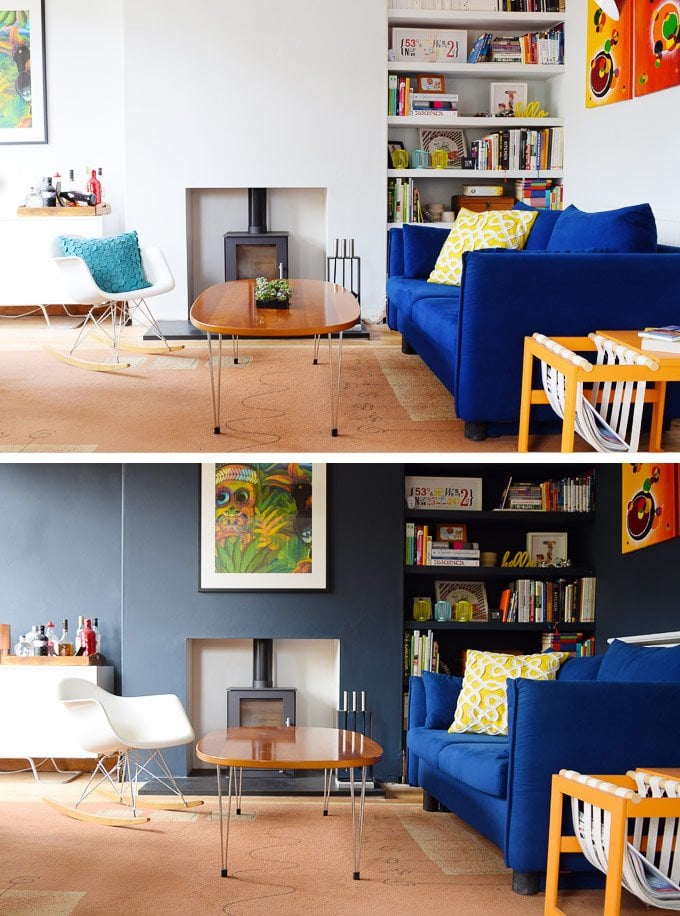
Di you use stiffkey in that sitting room picture? It almost looks like downpipe. It’s amazing the difference between the two shots. Well done you. If it is stiffkey, does it ever feel cold? Thanks a million
Christine says
The colour in the dining room is actually RAL 5008 (we call it Little House On The Corner blue ;)). You’re totally right about the colour difference – it changes so much depending on the time of day and the way the light falls into the room. We love the dark colour and will definitely be painting some of the rooms in our new home dark, too. It never felt cold – if anything the opposite!
Cx
Andrea says
The yellow is fabulous! I’m considering wallpaper for the first time in my new home, do you think you’ll take the plunge with some? It’s definitely having a moment!
Christine says
I love the yellow, too! It adds a bit of fun to an otherwise fairly muted colour palette.
We’d planned on using wallpaper in one of our bedrooms in our last home but then moved before we had a chance to paper the walls. We’ll definitely be using some in our new apartment. At the moment the plan is to have some wallpaper fun in the small guest bathroom but I have a feeling it might end up in other areas of our home, too.
Cx
Kerrie says
I did the 5 colours technique i saw on Remodelaholic blog some years ago. It worked brilliantly for me. Once I picked the colours I knew I was on the right track as I already had so many items that worked with these colours. I’ve been able to mix and match all over the place and so long as I keep the chosen colours in mind, it somehow doesn’t jar the eye
Christine says
I’d not heard of the 5 colour technique, Kerrie. It sounds really interesting and I’ll definitely check it out!
Cx