[Ad – This post is in collaboration with Dulux.]
We’re so excited to be sharing our newest home update with you today! Some of you may think that we’ve gone completely mad, but we think it’s amazing and still can’t quite believe that we were daring enough to do it.
After sharing yesterday’s post on how to introduce colour into your home when your decorating style is usually more neutral, we decided to listen to our own advice for a change.
We thought it would be fun to go all out and make a more adventurous design decision for a change. And that’s exactly what we’ve done!
If you’re wondering what on earth we’re on about – we’ve painted our dining room!
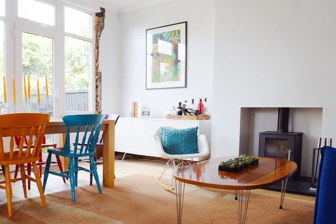
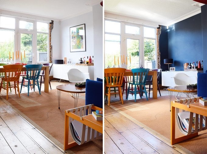
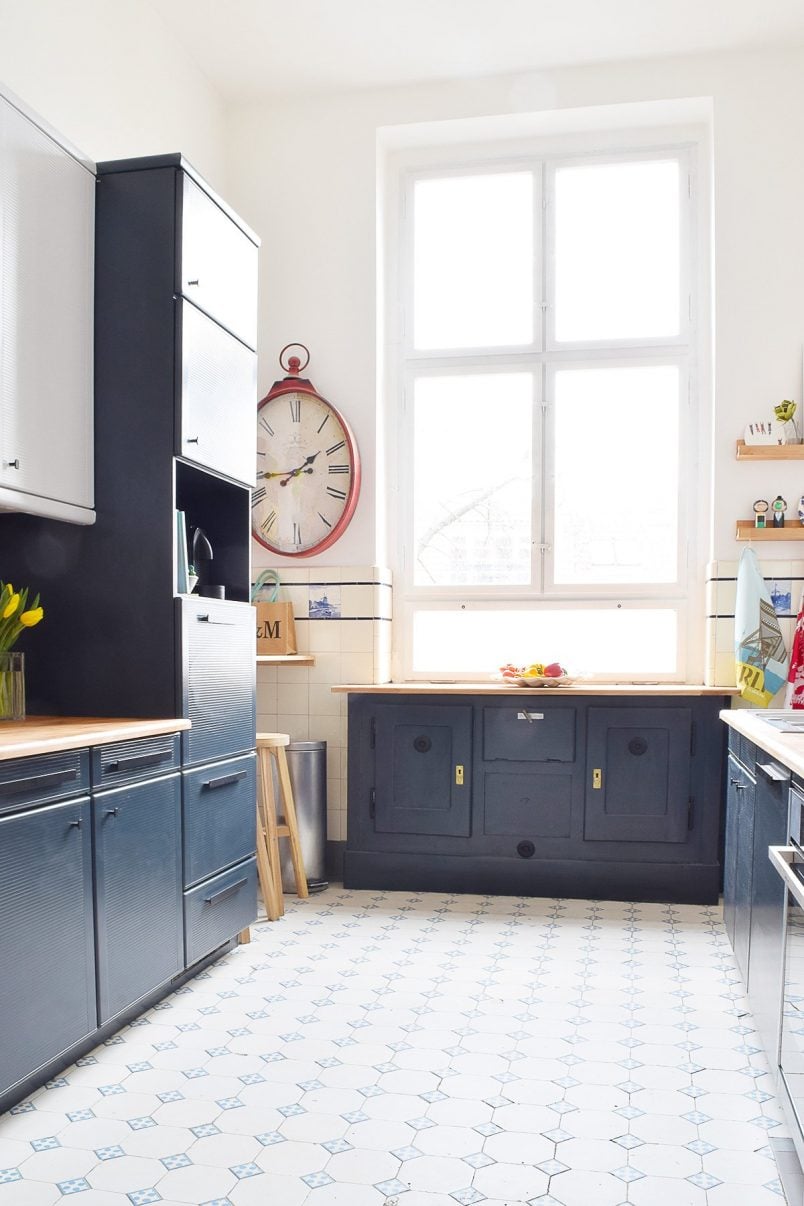
Here’s a reminder of what it used to look like:
But before we show you the results (no cheating and scrolling to the bottom!), we thought it would be fun to share how we came to the decision we made and the thought process behind it.
Usually, when we decide to paint a room it involves buying a load of tester pots, painting blobs of colour all over the room followed by countless discussions of what will work, then finally making a decision and often it’s still not the right choice.
So when Dulux told us about their free Visualizer App we were super keen to give it a test run. Anything that helps make design decisions easier, especially if you’re choosing a bold paint colour, has got to be a good thing.
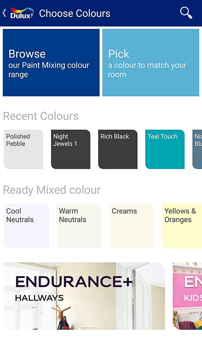
The app itself (for both Android and iOS) is genius.
All you do is point your phone at your room like you were about to take a picture, and it automatically assesses the space and recognises the areas that are walls.
Then you just choose from hundreds of colours (or it can match a colour in your room) and click on the wall you want to colour. The app then virtually applies the colour and you can see what your room will look like straight away.
If you’re happy with the result and look of your room you can then save the image to review later or even share it with friends and family.
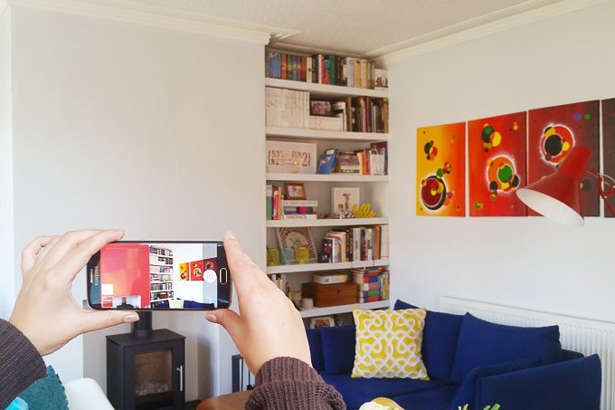
After first installing the visualizer app on my phone I probably spend a good hour walking through our house and “redecorating” every room. It’s so fun to see what your room would look like in different colours, and as always it’s amazing what a difference a bit of paint can make.
In general, the app works really well (although it does struggle in rooms that are dark) and recognised the walls and ceiling with a surprising amount of accuracy.
Of course, we also had a play around with some interesting colour choices in our dining room before actually deciding on one. Here are a few of the bold paint colour options we discussed.
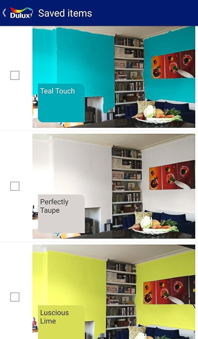
Teal Touch (An amazing colour but just a bit too much for us) / Perfectly Taupe (Lovely, but a bit too safe) / Luscious Lime (Wow. But also not for us)
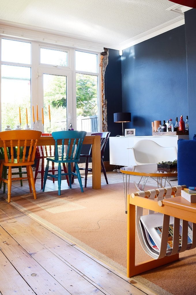
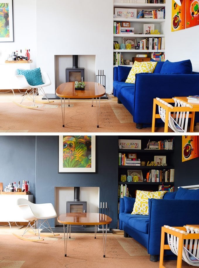
So, I’m sure you’re all dying to know what it is we actually went for and – drumroll please – here is our finished room!
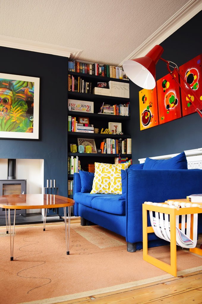
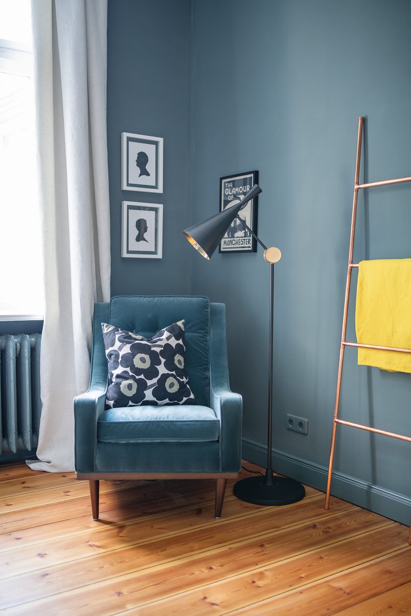
Yep, it’s black!
Well actually it’s a very dark blue-grey, but that doesn’t sound quite as dramatic, does it?
We would never have made such a daring decision if we did not see it in the app and visualise it first. I totally get that it’s not for everyone but we love how the colours of all of our books, art and other things really pop against the dark background.
Another reason that we felt like we could take the “risk” and go for such a bold statement is that Dulux offers a “Let’s Colour Guarantee” which means that if your colour isn’t right the first time, they will replace it for you!
Although we had a really good idea of what the room would look like thanks to the app. I totally admit that we did have an “omg, what have we done moment” when we applied the first coat of paint.
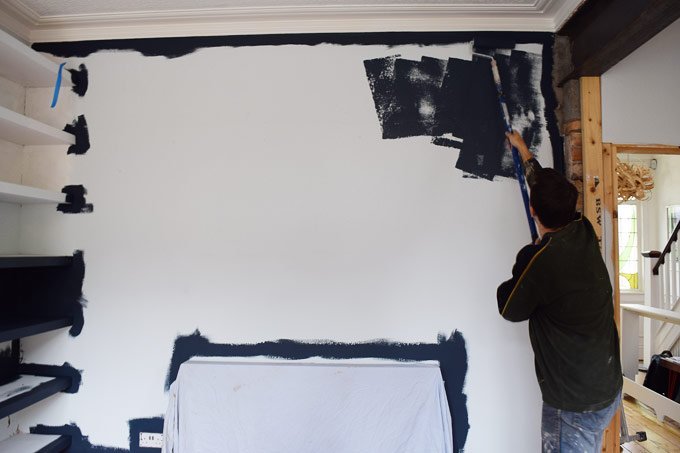
The contrast between the light walls that we used to have and the new dark colour is so extreme, but the more we painted, the more it felt right.
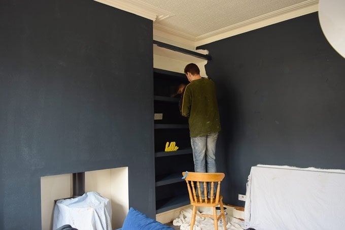
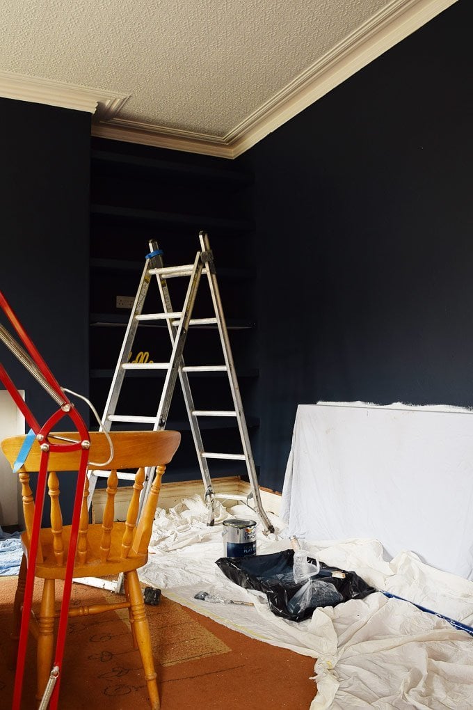
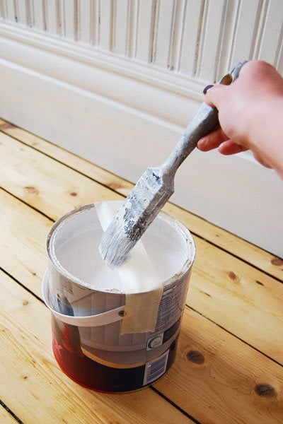
The paint covered really well and even after just the first patchy coat the room was totally transformed.
As always when we paint walls, we choose a flat matt finish (we used Dulux Durable Flat Matt). We think that it looks more contemporary and it hides any imperfections in the walls too.
We worried that the room would feel darker or smaller if we painted it a dark colour, but it doesn’t!
The area around our window is obviously still really messy. We hope to replace the window soon and will then reinstate the architrave, which should give us a nice clean edge to set off the dark colour.
We’re still kind of in shock, partly because this is by far the most daring decorating decision we’ve ever made but also because we spontaneously decided to paint the room on a Friday evening. We then bought rather bold paint colour first thing Saturday (usually it takes us weeks to decide) and now we are so happy with our choice.
I guess it just goes to show that a daring design decision can be a good thing!
What’s the most daring design decision you’ve ever made? Would you ever consider painting a room as dark as we have? Do you have a go-to, favourite colour for your walls that always seems to work? Do you have any tips on choosing a bold paint colour? Have you used the Dulux Visualizer App yet? What did you think of it?
SHOP OUR FAVOURITE PAINTING ESSENTIALS

Sim says
Very dramatic! Love it!
We went a cream colour when we did major renovations about 5 years ago. And after 5 years, it seems intolerably bland. We’re now renovating the original farmhouse section, and we’re being a lot more adventurous with colour. We love the Taubmans Hidden Meadow (a ‘dirty’ mid-dark green), and adore the kitchen that got changed up from Dulux Bamboo White (a soft green) to Taubmans Spruce Grove (is it green? is it blue? depends on the lighting and your mood!).
Christine says
Thank you! I totally know what you mean about your space feeling too bland. It’s always amazing how much difference a bit of paint can make! The greens you’ve used are gorgeous colours (I just had a quick google search) and your kitchen sounds gorgeous!
We actually just painted our bedroom a dark colour and we loved it so much that we painted everything – doors, radiators, skirting and even the light switches and sockets! We’ll be sharing the finished room in a couple of weeks but you can see the painting progress here.
Cx
Ingrid says
Absolutely great. I love how the room came alive.
Christine says
Thanks Ingrid! I totally agree with you and looking back it was kind of flat before.
Cx
Amy says
What is the name of the colour you actually went for in the end, it’s fab x
Christine says
Thank you Amy! The colour is RAL 5008 – not exactly the most exciting sounding name so we’ve dubbed it Little House On The Corner grey. ☺
Cx
lorraine says
This looks great. Sometimes making a quick decision works well. Spending too long making up your mind is terrible. My sitting room is wall papered in a designer guild paper in a colour very like the teal. A wonderful colour, but I feel the paper is dated, but can’t make up my mind on colour, thinking of neutrals. I think I will give the app a try. Though not sure if I would use Dulux, I’m a big fan of Little Green, but the app would give me an idea of what it would look like.
Thanks keep up the good work, enjoy the blog.
Christine says
Thanks Lorraine! We also tend to over think things and then end up doing nothing at all! The app is great and is surprisingly accurate. We’re fans of Little Greene, too, but are really happy (and surprised) with the depth of colour and quality of the paint we used in our dining room.
Cx
KarenAnita says
The colour is GORGEOUS. I absolutely adore deep blue on the walls and we’ve not got blue in nearly every room in the house haha ooooops!
Suits the space so well. Great choice :)
Karen x
Christine says
Thanks! We’d originally planned on painting the walls an even darker and more black shade, but are really happy with this colour. The blue colour definitely has a certain elegance about it – even in our messy home! ;)
Cx
anna says
very brave but the result is brilliant!!! We are redecorating our new house in UK too, but I usually go for “safe” bland colours so far…
Christine says
We chose safe colours for the past 5 years. So glad we decided to go bold this time. I’d totally recommend giving it a try Anna!
Cx
Carin says
Wow! I am totally floored! What a transformation. It looks wonderful! It has really brought your art, floor and furniture out! Fantastic!
Christine says
Thank you! We always kmew that paint is a great way to quickly transform a space, but seeing it make such a big difference in our own home is a really great feeling.
Cx
susan says
Oh wow! I love it. It gives the room definition and, you’re right, the colors of your books and artwork really shows up better. Nice job.
Christine says
Thanks Susan!
Cx
Lucy Caitlyn says
Looks fabulous, well done for the bravery :~)
I live in a very small 1 bed flat now (huge change from
3 bed terrace, 2 reception rooms + 120′ garden :~{
My living room has windows each end, chimney breast
and 4 doors eeeeekkkk.
Chimney breast is pale blue and other walls cream,
so I went mad and painted my doors black!
I was convinced I’d made the wrong decision, but I haven’t
the whole room looks bigger. Sorry can’t do pics as mobile
has divorced the computer :~( won’t let me post pics.
I’m a techno phobe to so don’t really understand the jargon
does android mean the “app” would work on my tablet?
BTW as I’m not the only “Lucy” I’ve now included my middle
name to save confusion :~)
Keep being bold!
Christine says
Your living room sounds lovely Lucy! I think our room feels larger now that it’s dark, too.
Yes, the app should work on your tablet, too. If it’s an iPad you’ll need the iOS version and if the system on your tablet is Android (almost every other tablet other than the iPad is) you’ll need the Android version. Just head to the App Store on your tablet and search for the Dulux Visualizer App – it’s really easy!
Cx
Lucy Caitlyn says
Thanks Christine, that’s brilliant.
Perfect timing too while I have my Spring/Summer look
and just a far too short a time before I’ll change to Autumn/Winter.
When the clocks change it’s time to steam clean anything that doesn’t
move (cats have learn’t to keep on the go :~}
I then change my soft furnishings, bedding (everything except the mattress), towels
and pictures.
It feels like I’ve redecorated twice a year :~) and I believe that things will last longer too having a seasonal rest.
This year, thanks to a couple of great sales the kitchen gets a change too with a
new kettle/toaster & microwave that match my Autumn/Winter colour scheme.
The vacuum bags help with storage issues.
Christine says
Wow, that sounds like a lot of seasonal work – we’re way too lazy to change things too much ;)
Cx
Lucy Caitlyn says
:~) work but fun, all done in a day!
Lins @Boo & Maddie says
Well do you even need me to say that I love it? It looks absolutely 100% amazing and definitely enhances all the other colours. Absolute thumbs up from me. And I’m definitely trying that app, how amazing is that? For now until we get all of the structural work done like floors and ceilings, we’re just keeping everything the white that we inherited but it definitely won’t be staying. I see it in others homes and it looks so amazing but it’s just not right for us X
Christine says
Aww, thank you so much Lins! I completely agree with you about the other colours – they really pop against the dark background. The app is really cool – the only problem is that it’s hard to put down. I got really carried away and even redecorated our local pub (sadly just virtually)!
Cx
Louise says
Looks lovely, a very nice muted and elegant color. I think the space looks a lot more together and furnished. The art even look artsier =)
Christine says
I totally agree Louise. There’s still a load of work to do in the room, but it suddenly feels a lot more finished and more homely. Our artwork definitely looks better on the dark walls, too.
Cx
Jessica@CapeofDreams says
Love it! The look is bold and beautiful.
Christine says
Thank you Jessica!
Cx
Ruth says
Wow – it looks great! Can I ask what colour you used? I’m trying to pick for my living room at the minute! Thanks
Christine says
Thank you Ruth. We matched the colour using the Dulux app and then had it mixed in store. The colour itself is RAL 5008 – not exactly the most exciting sounding name so we’ve dubbed it Little House On The Corner Grey ;)
Cx
Lucy says
Oh wow it looks absolutely brilliant. Thoroughly inspiring! Whenever we get around to painting walls I hope we’re as bold! x
Christine says
Thanks Lucy! You should definitely go bold – what’s the worst that can happen? If you don’t like it, it’s just a few hours of painting to change it again.
Cx
Lucy says
We had the same moment of panic when we decided to paint our tiny bathroom in charcoal grey… But it looks wonderful! Painting rooms white to look bigger is a myth. Love love love what you’ve done :)
Christine says
Thank you so much Lucy! It just goes to show that a darker colour can really work in most spaces.
Cx
Ann McG says
What a stunning result!
You are much braver than I would be. I love our all white walls but I sometimes think it is a bit dull… Having said that, we have teeny tiny windows because our home is so old, so we need to make the most of the light we get. You have that beautiful full length window to let all the light in.
Anyway, I love the choice.
Ann McG
Christine says
Thank you Ann! I still can’t quite believe that we were so daring – it’s really not like us! I do still love white walls as well though ;)
Cx
Kerrie says
Love it, looks wonderful
Christine says
Thanks Kerrie! We love it, too.
Cx